Posted on 11, Jan |
  Posted by Miguel Ruiz
Reeves Regional Health (RRH), founded in 1954 and previously known as Reeves County Hospital District (RCHD), is a Level IV Trauma Center that is located in Pecos, Texas, the County seat of Reeves County. Reeves Regional Health offers a wide variety of medical services, including emergency care, diagnostic radiology, physical therapy, general surgery, a clinical laboratory, and more. RRH is positioned in a designated rural and frontier county and is also designated as a Medically Underserved Area (MUA) and a Health Professional Shortage Area (HPSA). Since they are a very rural community with a highly indigent population, providing more healthcare services and providers at the local level greatly reduces the burden of travel for many of their residents who otherwise might not receive the care they need.
Reeves Regional Health staff members, Robins & Morton (General Contractors) and community members gathered to celebrate the groundbreaking of the new Reeves County Hospital replacement facility on November 8, 2019.
This $80 million project represented the district’s investment in a total replacement of the community’s hospital, which included 25 all-private inpatient beds, a level four emergency department with at least eight exam rooms and three trauma rooms, a delivery suite, a nursery, women’s imaging department, a physical therapy gym, a 15-bay dialysis unit, surgical services space, an inpatient/outpatient lab, a cardiovascular rehabilitation program, and support service spaces. The design, led by project architect Perkins&Will of Dallas, Texas, was 140,000 square feet and has the goal of LEED Certified under LEED for Healthcare’s v4 rating system.
Reeves Regional Health was in the extraordinary position of setting and determining the future of the health system. As the new replacement hospital was in development, it opened the opportunity to tell the story of who RRH is, where they have come from and where they are going. Healthcare has changed. It will always be about service but now, controlling the experience is necessary for gaining patient and visitor satisfaction. Most systems have been overburdened with the complexities associated with obtaining a positive patient and visitor experience but now there are new methods and ideas to make this happen.
The Reeves Regional Health brand wanted to be aligned with the new growth and direction of the health system. The consensus was that the brand should reflect the future of healthcare with a new state-of-the-art facility but also maintain the history behind RRH. The previous brand had been diluted over time and needed to be refreshed to accompany the new construction.
FMG Design was engaged to develop a refreshed brand, story, and experience for Reeves Regional Health that in essence, tells the story of RRH. FMG determined and developed the parent healthcare system name and designed the logo variations for the hospital and various clinics.
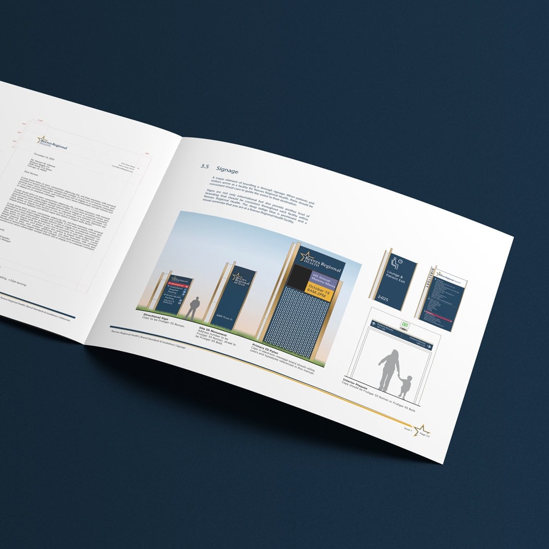
In addition, FMG created a Brand Standards Manual based on the approved refreshed brand for Reeves Regional Health. The Brand Standards Manual included general specifications such as an overview, the definition of terms, goals and objectives, general brand guidelines for logo placement, incorrect uses, typefaces, colors and brand components, applications, and more.
The previous logo, although bold, had an outdated feel with an overwhelming presence of a single color and lacked continuity with the new healthcare vision of the new hospital. In addition, the previous name, Reeves County Hospital District, was a token of the past and had been built from the history which encompasses the city of Pecos.
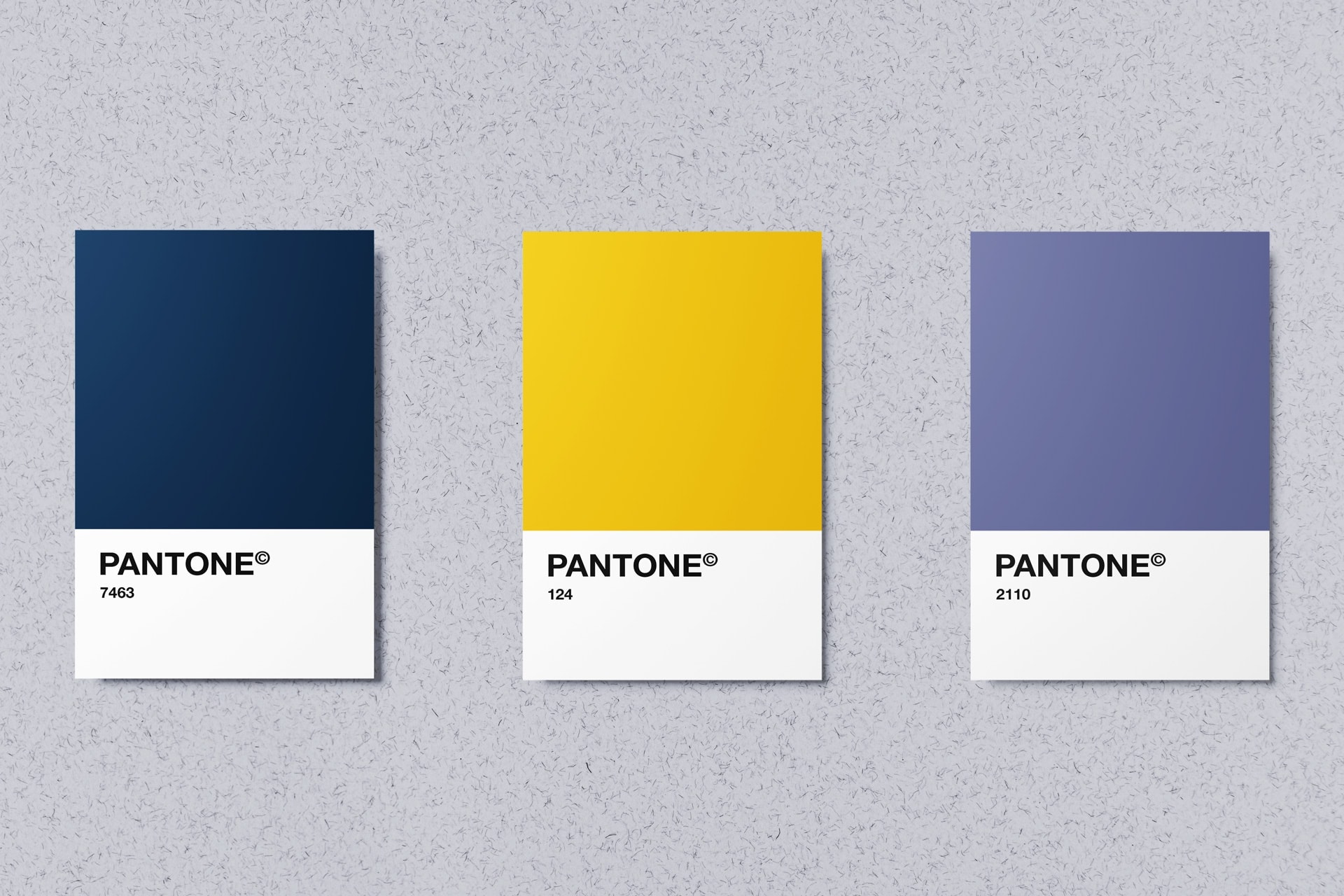
Through our conversations with the hospital and community, there was a consensus between everyone that the use of “County” in the name was both confusing and restrictive. We started by addressing the current name and logo for brand refinement by eliminating “Hospital District” and creating a parent brand. Considering all factors, we explored several similar arrangements, removing the excess and refining the name while keeping Reeves. We moved further down a different path with an exploration of colors. By utilizing complementary colors, navy and gold, the logo was given a fresh update that feels clean, bright and simple.